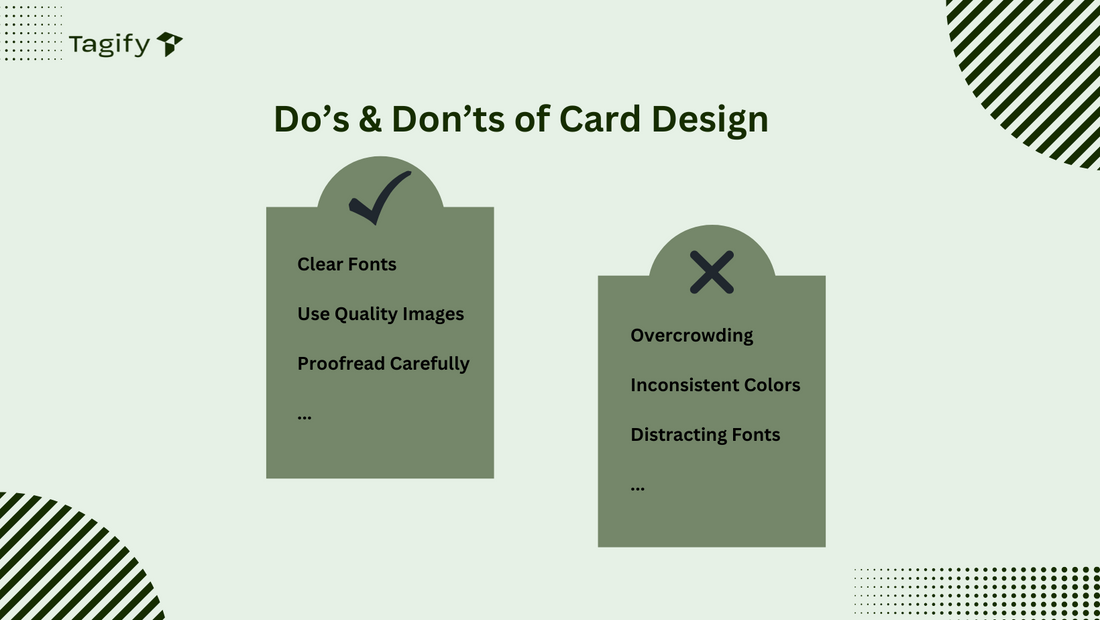
Do’s & Don’ts of Card Design

Designing Your Custom Business Card: Do’s and Don’ts
A well-designed business card is more than just contact information; it’s an extension of your brand and a key tool in making memorable first impressions. Here are some essential do’s and don’ts to help you design a custom business card that’s both professional and impactful.

Do’s for Designing a Custom Business Card
-
Do Prioritize Readability
- Choose Legible Fonts: Opt for clear fonts in readable sizes, ensuring all text is easy to read at a glance.
- Maintain Simplicity: Avoid overcrowding the card. Stick to essential information, such as your name, title, company, and contact details.
-
Do Use High-Quality Images and Logos
- Opt for Vector Graphics: Use high-resolution images or vector graphics to keep logos and images sharp and professional.
- Consistent Branding: Incorporate brand colors, fonts, and logo placement that align with your overall branding to reinforce brand identity.
-
Do Consider NFC and QR Code Placement
- Strategic Placement: If integrating NFC technology or QR codes, place them where they’re easily accessible but don’t overshadow key information. Test the functionality of any QR code for accurate scanning.
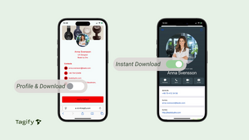
- Clear Instructions: If the QR code or NFC has a specific function (like opening a portfolio or contact download), mention it in a small caption to encourage use.
-
Do Choose the Right Material and Finish
- Select Appropriate Materials: Choose a material that reflects your industry and image (e.g., metal for a premium feel, eco-friendly paper for sustainability).
- Add Finishing Touches: Consider options like matte or gloss finishes, embossing, or raised text for a unique, tactile experience.
-
Do Provide Organized Files for Bulk Orders
- Simplify Bulk Orders: If you’re ordering a large quantity with multiple designs, you can submit your files in the way that works best for you. For example, you may send one PDF file containing all the designs or separate files for each design. Organizing the files will ensure smooth processing and accurate production of each card.
-
Do Proofread Carefully
- Double-Check Details: Errors in your contact information, such as phone numbers or email addresses, can harm your professional image. Review every detail meticulously before printing.
Don’ts for Designing a Custom Business Card
-
Don’t Use Cluttered Designs
- Avoid Overcrowding: Resist the urge to add too much information or overly intricate designs. A busy card can make it hard for recipients to focus on key information.
-
Don’t Use Inconsistent Colors
- Stick to Your Brand Palette: Using too many colors can distract and look unprofessional. Stick with brand colors to ensure your card complements your overall branding.
- Avoid Low Contrast: Make sure text contrasts with the background for easy reading. Light text on a dark background or vice versa is generally effective.
-
Don’t Rely on Cheap Paper or Low-Quality Printing
- Choose Quality Materials: Thin or low-quality materials can make your card feel disposable. Opt for materials that convey the right impression for your brand.
- Avoid Poor Printing Quality: Blurry or smudged print can damage your professional image, so ensure high-quality printing that does justice to your design.
-
Don’t Use Distracting Fonts or Excessive Capitalisation
- Avoid Decorative Fonts: Decorative fonts or excessive capitalisation can make your card look cluttered and difficult to read. Stick to professional fonts that align with your brand.
- Limit Font Styles: Use one or two fonts at most to keep the design cohesive and professional.
-
Don’t Forget About White Space
- Use White Space Wisely: White space isn’t wasted space; it helps guide the reader’s eye to important details. A balanced design with ample white space feels clean and professional.
Conclusion
Creating a custom business card is an art in itself. By following these do’s and don’ts, you can design a card that reflects your brand and creates a lasting impression. Whether you’re going for a minimalist look or a high-impact design, keeping readability, quality, and functionality in mind will ensure your card stands out and serves its purpose effectively.
For added convenience, visit our design templates page where you can choose a template, customize it to fit your style, and even remove or add elements. Once you’re satisfied, save your design and send it to us for printing, and we’ll help bring your unique business card to life.


